Data Overload and Always-Red Dashboards
We’re all exposed to a lot of data both in our personal lives and at work. At work, we see dashboard, KPIs, statistics and data all the time. Most of the time, this data is mildly interesting but does not really make a change in our behavior or habits. This week’s newsletter is about designing dashboards that matter, presenting less data and getting more done, read on!
Design Guidelines for an Optimal Dashboard
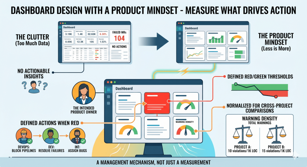
The concepts to internalize are that a number shown on a dashboard, a dashboard item, is a management mechanism, not a measurement. It must have an intended user, it must define its red/green thresholds, it must define actions when it’s red and it must be normalized for cross-project comparisons. Let’s review these principles in more detail
Let’s start with an intended user. When you decide to add an item to a dashboard, you need to answer the following question first: “who is going to consume this item?” Who is the user role in the organization that needs to see this number, who are we designing it for? An item on your dashboard is like a product requirement, it needs to stem from a user need. You have to define the need. For instance: “management wants to know how many successful test passes we had last week”, so we are adding this item for the management team. Avoid the temptation to add items just because you have the data available. If there is no demand for it, adding it is like adding another feature to your product without a user need. It adds clutter and creates confusion.
Let’s move on to the red/green thresholds. When you decide to add an item to a dashboard, you need to define clearly when is this item ‘green’, meaning it is within the acceptable range and when does it turn ‘red’, meaning it has deviated from the acceptable range. If you can’t tell what a good number is from a bad number for that specific metric, it does not belong on your dashboard. For example, many DevOps dashboards have the metric of “number of failed merge requests” or “percentage of failed merge requests”. Seems very logical to monitor it. The problem is that it is impossible to decide what a good number is and what a bad number is. If many merge requests are failing is that a bad thing? Aren’t we expecting the merge gates to catch issues? So we’d like the number to be high. But if all the merge requests are passing is that a good thing? Does it mean the quality bar is high and developers pass it or does it mean the quality bar is too low? Simply put, we can’t decide what a good number is and so adding it to the dashboard is meaningless because the intended user can’t do anything when looking at this number.
Now we define the actions. We have an item in the dashboard, we have an intended user who is interested in this piece of data. We know when to paint it green or red and now comes the interesting part. When the item turns red, you have to define the specific actions the intended user needs to take in order to return the item to green. If a number is red but it is not clear who needs to do what and when, then this number does not belong in a dashboard. Think about the fuel indicator on your car’s dashboard. When it lights up, it is very clear to you what action is needed from you and when to switch it back to ‘green’. A similar analogy needs to be applied to any item on any dashboard. Last night’s tests failed? Is the pass rate now red? Ok, who needs to do what in order to fix it today so it is back to green tomorrow? The integration team needs to open the bugs and assign them, the DevOps team needs to block the pipelines for further merges and the development team needs to resolve the failures within the day. Clear actions for specific individuals so that the dashboard goes back to green. The dashboard should be always green or on its way to green with clear indications on the team members who are working on it. If a dashboard is constantly red (as you might have noticed quite often) then it is meaningless in improving the product or changing behavior
Lastly, normalize the data. In order to benchmark projects you need to present the data in a normalized format. So for inst ance, do not show the number of static analysis violations, show the static analysis warning density, how many of those, by severity, are there for every 1,000 lines of code. That is easy to normalize, easier to set company wide standards and compare projects one to the other.
Final Thoughts
In recent experiments we’ve run with our clients, we’ve seen how this approach, reduces the number of dashboards, increases the actual actions taken and reduced the cognitive load from watching the ‘always-red’ dashboards
You are done! Now you have meaningful and actionable dashboards at your disposal. Good work.
Remember the design principle: If a metric can become red and nobody knows who should do what next, it does not belong on the dashboard
Thanks for reading!